
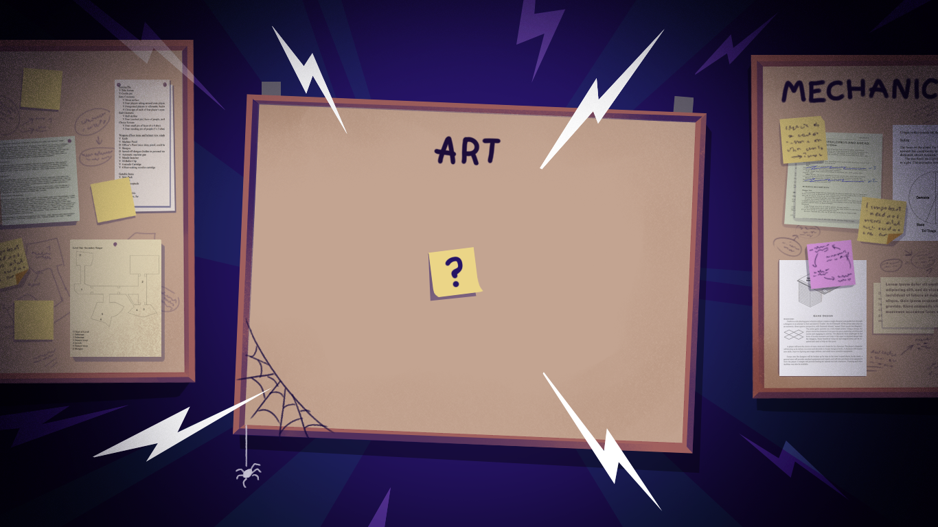

A lot of the devs we partner with at MLC share a similar story. The mechanics are coming along nicely, and everything else is making good progress, but the art side has kind of become the blocker.
Being stuck on art doesn’t only mean one thing though. When we sit down and talk through what’s actually going on, it usually turns out to be one of a few different kinds of stuck, and which one it is changes what helps. Let’s run through what’s going on and how to get unstuck.
Freelancer Art is Becoming Inconsistent
This one can sneak right up on you. You made a sensible decision, hiring a character artist for the protagonist, and when the world started forming you brought in an environment artist or a UI/UX artist for the polish stage. Individually, the work coming back was good.
Then it all landed in the same level, and something was off. The characters were stylised one way, the environments slightly differently, and the UI had its own visual logic. Looking at any single asset, it was fine, but together they looked like three different games spliced together!
Here’s the thing: none of the freelancers were necessarily doing a bad job. The gap sits above them. There was never a shared direction pulling the work together, and without one, individually good art doesn’t add up to a cohesive game. It’s usually the first thing a publisher or a player notices, even before they can say what’s bothering them.

One Style Bible, One Source of Truth
A proper style bible closes that gap. It’s something everyone, including the freelancers already on the project, can use as a single source of truth. It doesn’t need to be a super fancy deck. A working reference that tells anyone touching your art what world they’re building for is all you need. (We’ll come back to what one looks like properly a bit later, because “just write a style bible” is one of those things people say a lot without ever expanding on what that means.)
Placeholder Art is Starting to Block Important Milestones
Placeholders can often work for longer than expected. Grey boxes are fine while you’re prototyping, and rough sprites will get you through a vertical slice without much trouble, especially if no one outside the project is looking at the game yet.
Then a real milestone shows up on the calendar, whether that’s a Steam demo, a publisher meeting, or key art you need for a wishlist campaign. Suddenly the placeholders are what everyone’s judging the game by, and grey box footage doesn’t do the job of art. It rarely wins over publishers or earns Steam wishlists, and playtesters can’t give you a fair read on something that doesn’t visually exist yet.
The instinct at this point is often “make all the art now,” which isn’t realistic and also isn’t what the milestone actually needs.

Pick One Corner, Finish it Properly
What we find works well here is what we call the ‘beautiful corner’. Once your direction is set (you have your art bible of sorts) and you know what the finished game should look like, pick one small section (a biome, a street of a level, or a single scene) that’s genuinely representative of the gameplay and the world’s feel. Then polish it all the way up. Everything that would exist in the shipped version: final art, final lighting, props, UI, all done to the standard the shipped release deserves.
That one polished corner does an enormous amount of work for you. It’s the thing you show a publisher when they ask what the finished game will look like. Your key art and trailer footage can get built from it. And once it exists, it sets the internal standard for anyone else touching the project. Everyone can see exactly what “finished” looks like for the game, and there’s no longer any ambiguity about the quality bar they’re working toward.
In our experience, publishers aren’t judging you on whether every asset in the game is done yet. They’re looking for whether the game plays and feels the way you’re pitching it, and whether it’s actually going to connect with players when it ships. A beautiful corner can answer that better than half-finished art across the whole game.
Art Scope Creep is Making Deadlines Slip
Everything’s ticking along nicely, and the game is progressing, but at some point you look at your milestones and realise they’re starting to feel further away than they did a month ago. The art backlog has been growing faster than it’s being cleared. That could be because scope crept up on the game (a mechanic that turned into three, or a level that needed twice the assets it was scoped for). Sometimes it’s because the style is taking longer per asset than anyone estimated upfront.
Either way, the release date you had in mind is starting to look a bit less realistic than it did. That’s the gap between hitting your demo date and explaining to a publisher why you need another quarter.
The first instinct is often to try and keep everything in and just work harder. That rarely works. Something usually has to give, and the real question is which thing hurts the game the least.

Where the Time Can Come From
One option worth considering first is whether the style itself could give way a little, without losing what makes the game recognisable. That might mean going slightly less detailed on your fidelity, or finding smarter ways to share geometry between props and enemies so the same base work covers more of the game. Style adjustments like these can sometimes save weeks of production time without cutting anything the player would actually notice.
The other option is cutting content, which is often the right move. Some things on the roadmap are nice-to-have rather than core to how the game plays or feels, and that’s usually where cuts should come from. The tempting thing is to cut whatever’s noisy on your sprint board right now, but you’re usually better off cutting whatever’s actually earning its keep the least. And cuts don’t have to be permanent either. Keep them in your back pocket for a future content update.
The Game is Starting to Look Generic
This one’s harder to describe than the others, which is probably why it’s so common. Everything’s working, the game plays fine, but every conversation about the art keeps coming back to the same thing: “it looks alright, but nothing about it really stands out.” The individual assets are decent, but when you put them together the game doesn’t have its own visual identity yet.
This is a painful place to be, because nothing looks broken. It can go on for ages, and the longer it does, the more assets get built against a direction that isn’t quite settled. When the direction finally gets decided, there’s a lot of already-made work that needs redoing or reworking to fit.

Get an Outside Eye on it Early
Sort it early. Ideally with someone whose actual job is looking at game art and giving you an honest read on how it’s landing. The trouble with feedback at this stage is that even when people are being brutally honest with you (like on Reddit), they tend to focus on specific assets rather than the direction sitting underneath them. What you’re looking for is someone who can diagnose the direction problem itself. Even a couple of hours of that kind of review can reset a project that’s been drifting for months, and it’s a far cheaper problem to fix now than after another six months of building on top of it.
Why do Art Bottlenecks Happen in the First Place?
Look at the four versions together, and the same underlying gap sits at the bottom of all of them. Nobody is thinking about the art as one connected thing across the whole game.
Here’s a good comparison: Mechanics get thought about at that level because someone on the project is a designer, or at least thinks like one. The codebase gets thought about at that level because there’s a lead developer, or a solo dev holding it together. Art, on smaller indie projects, tends not to get that same treatment, because there can be an assumption that art is just the sum of the assets. In reality, the art is the shared decisions holding those assets together, and someone has to be watching those decisions, or they won’t get made effectively.
So, How do you Actually Build a Style Bible?
A style bible is a working reference document. Every artist who touches your game (in-house, freelance, contracted studio) opens it before they start work, so they know what world they’re building for and what “right” looks like on your project specifically
Here’s what actually goes into a useful one. The order matters, because early sections give context that makes the later ones make sense.
- The game in one paragraph. What is it, who’s it for, what’s the tone? Not a marketing blurb. Something like “A cosy island-based café management game set in a fantasy 1900s countryside. Warm, welcoming, homely. Players should feel like they’re being invited into somewhere lovely.” If an artist reads that and immediately knows what mood they’re painting toward, you’ve done the job.
- The world. Where does the game take place, in-fiction? What’s the time period, the level of technology, the real-world influences, the general atmosphere? If your world has zones or biomes (a woodland, a magical forest, an outskirt versus a town centre), name them and give each its own note on what makes each one feel distinct from the others.
- References with intent. It shouldn’t be a mood board of everything you like. Instead, jot down a short list of specific games, films, illustrators or real-world sources, each with a note on what specifically you’re taking from them. “Studio Ghibli for the colour language: warm foregrounds, cool backgrounds, strong atmosphere.” “Animal Crossing for the feeling of the community and the cosy architecture.” “This Kyoto photograph for how traditional Japanese roof tiles catch the light.” Named intent beats a wall of pretty pictures every time, because it tells artists which parts to draw from and which parts to leave alone.
- Colour palette. Actual hex codes, not “warm colours.” Show the palette next to the references it came from, so artists can see how it’s being used. If your game has different zones or moods, each one gets its own palette with a note on when to use it. This is one of the highest-leverage sections you can build, because inconsistent palettes is a common reason a game ends up not feeling cohesive.
- Level of detail and fidelity. How detailed is a hero asset versus a background one? How much visible texture is too much? Show examples of what “right” looks like at each level, and (this is the part most bibles skip) show examples of what “wrong” looks like too. A background barrel that’s been detailed to hero standard is just as off-brief as a hero prop that looks like set dressing. Contrast between what you want and what you don’t makes the target clearer than any amount of description.
- Shape language and silhouettes. This matters more than you may realise. Are your characters rounded or angular? Do buildings have soft or sharp edges? Are plants stylised or naturalistic? A single line and a couple of shape examples per category is enough. Consistency of silhouette is what makes a game feel like it was designed by one hand, even when it wasn’t.
- Lighting and mood. Is the light warm or cool? Where does it come from? What kind of shadows does the game have (hard, soft, coloured)? Getting this right early is what keeps environments and characters from drifting apart visually when multiple artists are working in parallel.
- Characters, if the game has them. How anthropomorphic? How stylised versus realistic? Chibi in proportion or grown-up? What about clothing and cultural references? Show on-brief examples alongside off-brief ones. In the My Café bible we built for one of our own projects, we put “too chibi” and “too realistic young” character examples right next to the ones we were aiming for, because it’s much easier for an artist to hit the target when they can see where the edges are.

- Anything specifically off-limits. If there are visual conventions you don’t want in the game, say it. For example, your cosy game shouldn’t have anything grim or your stylised fantasy shouldn’t drift into anime, it’s important to clarify it. Naming the boundary lines out loud saves everyone a difficult revision conversation later.
A useful art bible for an indie game doesn’t need to be dozens of pages. 10-20 focused pages with real examples and specific intent will outperform a hundred pages of general aspiration. What matters most is that when a new artist joins the project, or your existing freelancer starts on a new asset type, they can open it, spend 15 minutes with it, and know what they’re building toward.
If you sit down to write one and find yourself stuck on the references section, or unable to articulate what your palette actually is, that’s normal. It means the direction isn’t set just yet
How MLC Studio Partners with Indie Developers
Most of what we’ve just talked about is what we spend a lot of our time on. What we care about is helping indie games get to a place where they’ve got a genuine chance of succeeding with players and publishers.
Before we scope any art, we want to understand where you are in development, what you’re trying to build, who you’re making it for, and what success looks like. Your game. Your vision. We’re just here to make sure the art keeps pace. Everything we do from there is to get the game to a place where it actually ships successfully and players love it.
Day to day, that’s a dedicated team around you on Discord (artists, producer, art director) who know your project well enough to catch problems before they become expensive ones, from pipeline decisions to a second opinion on direction whenever you need it.
What that adds up to: a team that cares whether your game actually ships. We’re in it from the first scrappy conversation before there’s even a prototype, right through to post-launch updates.
If any of the four kinds of “stuck” sound like where you are right now, or you’re staring at the style bible we’ve just described and thinking “I don’t even know where to start with this,” that’s exactly the kind of conversation we love having. Get in touch and tell us about your game, no brief required.